

Machine learning and other gibberish
See also: https://sharing.leima.is
Archives: https://datumorphism.leima.is/amneumarkt/
See also: https://sharing.leima.is
Archives: https://datumorphism.leima.is/amneumarkt/
#visualization
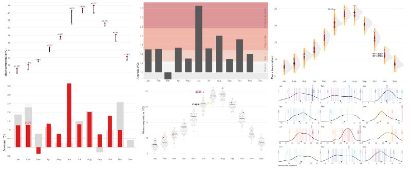
Broken Chart: discover 9 visualization alternatives – Dr Dominic Royé
https://dominicroye.github.io/blog/2025-12-14-broken-charts/
Broken Chart: discover 9 visualization alternatives – Dr Dominic Royé
https://dominicroye.github.io/blog/2025-12-14-broken-charts/
#visualization
Plotly will supports polars natively in v6 .
https://github.com/plotly/plotly.py/releases/tag/v6.0.0rc0
Plotly will supports polars natively in v6 .
https://github.com/plotly/plotly.py/releases/tag/v6.0.0rc0
#visualization
Beautiful. There are details that the author designed quite well.
How long are the nights?
https://plotparade.com/gallery_sunrise.html
Beautiful. There are details that the author designed quite well.
How long are the nights?
https://plotparade.com/gallery_sunrise.html
#visualization
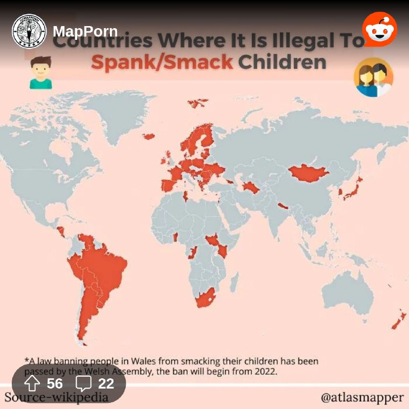
Some comments in this post are just so funny.
https://www.reddit.com/r/MapPorn/s/HsLvLGzLb6
Some comments in this post are just so funny.
https://www.reddit.com/r/MapPorn/s/HsLvLGzLb6
#visualization
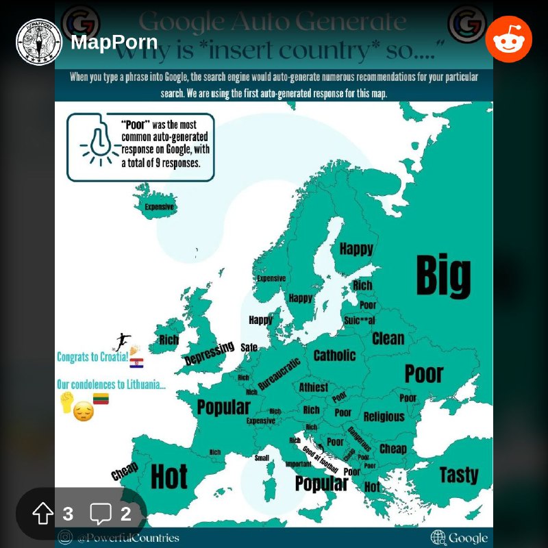
Finland vs UK, and
Turkiye/Turkey is such a nice example of data quality issues.
https://www.reddit.com/r/MapPorn/s/QYGauVmzOP
Finland vs UK, and
Turkiye/Turkey is such a nice example of data quality issues.
https://www.reddit.com/r/MapPorn/s/QYGauVmzOP
![From the dataisbeautiful community on Reddit: [OC] Most cost-competitive technologies for energy storage](/static/https://cdn4.telesco.pe/file/jpFTnoYcFGjCEjZ_vcygq89duGPL-RHfUbXsrY0z0d2bRxxVEzLMEvizwVlgTyE-FNLhKD-8X4bX5Xo2dpctR5_QEvEHEegrOWxlNuPGCCa5D5sxKga24mCQrjrPzWv7ci3dYMWAug8br_ULst9BqUwX9AzvY-R31YCgOvS8zuOOUmJJteIZJQFAvoRzWyVT822s09IFoPhEMMIh4oFXiAOouhlUno7lpa-5sMPRrLGS3K5yVUKfxM2m0Ca25j53aJWRhZ_yTfWL7HoniK2QKie4jKeWniscNw-ClVrur5poV31W48t8ilPsfTILF5mw3d0AqPFpGmmTQ8cazon2QA.jpg)
#visualization
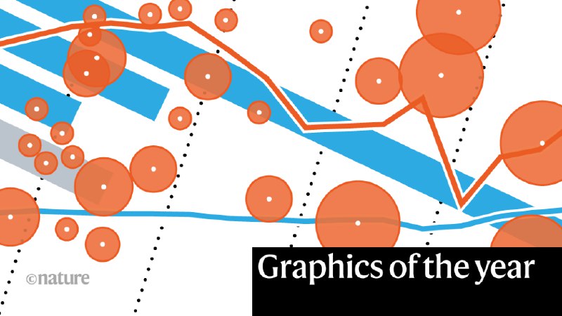
This is a great post. I certainly don’t agree with the author that this is “the greatest statistical graphics ever created”. But I can’t prove myself either.
Also, just like coding, “design it twice (or even more times)” is a great way to produce the best charts. That being said, we should keep making different versions and start to compare them with each other.
https://nightingaledvs.com/defying-chart-design-rules-for-clearer-data-insights/
#visualization
Demographic projection for Germany
https://service.destatis.de/bevoelkerungspyramide/index.html#!y=2023&v=4&l=en&g
Demographic projection for Germany
https://service.destatis.de/bevoelkerungspyramide/index.html#!y=2023&v=4&l=en&g
#visualization
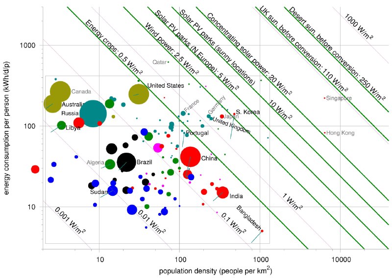
Visualizations of energy consumption and prices in Germany. Given the low temperature atm, it maybe interesting to watch them evolve.
https://www.zeit.de/wirtschaft/energiemonitor-deutschland-gaspreis-spritpreis-energieversorgung
Visualizations of energy consumption and prices in Germany. Given the low temperature atm, it maybe interesting to watch them evolve.
https://www.zeit.de/wirtschaft/energiemonitor-deutschland-gaspreis-spritpreis-energieversorgung
What is going on with trolli? Was ist passiert?
https://www.visualcapitalist.com/gen-z-favorite-brands-compared-with-older-generations/
> Tracking of an Eagle over a 20 year period.
Source:
https://twitter.com/Loca1ion/status/1566346534651924480?s=20&t=AKXn9U-L3fyhrJzeAXySlA
Hmm not so many contributions from wild animals.
Source: https://www.weforum.org/agenda/2021/08/total-biomass-weight-species-earth
Data from this paper: https://www.pnas.org/doi/10.1073/pnas.1711842115#T1