
Machine learning and other gibberish
See also: https://sharing.leima.is
Archives: https://datumorphism.leima.is/amneumarkt/
See also: https://sharing.leima.is
Archives: https://datumorphism.leima.is/amneumarkt/
Deepnote supports Great Expectations (GE) now.
I ran their template notebook:
https://deepnote.com/project/Reduce-Pipeline-Debt-With-Great-Expectations-mLT9DFCQSpW4kUBAzzdhBw/%2Fnotebook.ipynb/#00000-e170fae0-7e06-4a7a-85f3-343584ec4b94
#data #ds
Disclaimer: I'm no expert in state diagram nor statecharts.
It might be something trivial but I find this useful: Combined with some techniques in statecharts (something frontend people like a lot), state diagram is a great way to document what our data is going through in data (pre)processing.
For complicated data transformations, we can make the corresponding state diagram and follow your code to make sure it is working as expected. The only thing is that we are focusing on the state of data not any other system.
We can use some techniques from statecharts, such as hierarchies and parallels.
State diagram is better than flowchart in this scenario because we are more interested in the different states of the data. State diagrams automatically highlights the states and we can easily spot the relevant part in the diagram and we don’t have to start from the beginning.
I documented some data transformations using state diagrams already. I haven't tired but it might also help us document our ML models.
References:
1. https://statecharts.dev
2. https://en.wikipedia.org/wiki/State_diagram
#DS #visualization
https://percival.ink/
A new lightweight language for data analysis and visualization. It looks promising.
I hate jupyter notebooks and I don't use them on most of my projects. One of the reasons is low reproducibility due to its non-reative nature. You changed some old cells and forgot to run a cell below, you may read wrong results.
This new language is reactive. If old cells are changed, related results are also updated.
#DS
Just in case you are also struggling with Python packages on Apple M1 Macs
I am using the third option: anaconda + miniforge.
https://www.anaconda.com/blog/apple-silicon-transition
Just in case you are also struggling with Python packages on Apple M1 Macs
I am using the third option: anaconda + miniforge.
https://www.anaconda.com/blog/apple-silicon-transition
#DS #Visualization
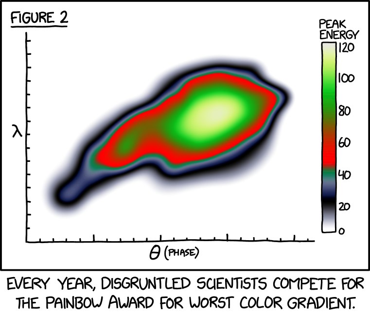
Okay, I'll tell you the reason I wrote this post. It is because xkcd made [this](https://xkcd.com/2537/).
---
Choosing proper colormaps for our visualizations is important. It's almost like shooting a photo using your phone. Some phones capture details in every corner, while some phones give us overexposed photos and we get no details in the bright regions.
A proper colormap should make sure we see the details we need to see. To address the importance of colormaps, we use the two examples shown on the website of colorcet[^colorcet]. The two colormaps, hot, and fire, can be found in matplotlib and colorcet, respectively.
I can not post multiple images in one message, please see the full post for the comparisons of the two colormaps. Really, it is amazing. Find the link below:
https://github.com/kausalflow/community/discussions/20
It is clear that "hot" brings in some overexposure. The other colormap, "fire", is a so-called perceptually uniform colormap. More experiments are performed in colorcet. Glasbey et al showed some examples of inspecting different properties using different colormaps[^Glasbey2007].
One of the methods to make sure the colormap shows enough details is to use perceptually uniform colrmaps[^Kovesi2015]. Kovesi provides a method to validate if a color map has uniform perceptual contrast[^Kovesi2015].
---
References and links mentioned in this post:
[^colorcet]: Anaconda. colorcet 1.0.0 documentation. [cited 12 Nov 2021]. Available: https://colorcet.holoviz.org/
[^colorcet-github]: holoviz. colorcet/index.ipynb at master · holoviz/colorcet. In: GitHub [Internet]. [cited 12 Nov 2021]. Available: https://github.com/holoviz/colorcet/blob/master/examples/index.ipynb
[^Kovesi2015]: Kovesi P. Good Colour Maps: How to Design Them. arXiv [cs.GR]. 2015. Available: http://arxiv.org/abs/1509.03700
[^Glasbey2007]: Glasbey C, van der Heijden G, Toh VFK, Gray A. Colour displays for categorical images. Color Research & Application. 2007. pp. 304–309. doi:10.1002/col.20327
[^matplotlib-colormaps]: Choosing Colormaps in Matplotlib — Matplotlib 3.4.3 documentation. [cited 12 Nov 2021]. Available: https://matplotlib.org/stable/tutorials/colors/colormaps.html
#DS #news
This is a post about Zillow's Zetimate Model.
Zillow (https://zillow.com/ ) is an online real-estate marketplace and it is a big player. But last week, Zillow withdrew from the house flipping market and planned to layoff a handful of employees.
There are rumors indicating that this action is related to their machine learning based price estimation tool, Zestimate ( https://www.zillow.com/z/zestimate/ ).
At a first glance, Zestimate seems fine. Though the metrics shown on the website may not be that convincing, I am sure they've benchmarked more metrics than those shown on the website.
There are some discussions on reddit.
Anyways, this is not the best story for data scientists.
1. News: https://www.reddit.com/r/MachineLearning/comments/qlilnf/n_zillows_nnbased_zestimate_leads_to_massive/
2. This is Zestimate: https://www.zillow.com/z/zestimate/
3. https://www.wired.com/story/zillow-ibuyer-real-estate/
Microsoft created two depositories for Machine Learning and Data Science beginners. They created many sketches. I love this style.
https://github.com/microsoft/Data-Science-For-Beginners
https://github.com/microsoft/ML-For-Beginners
#DS
Cute comics on interactive data visualization
https://hdsr.mitpress.mit.edu/pub/49opxv6v/release/1
Cute comics on interactive data visualization
https://hdsr.mitpress.mit.edu/pub/49opxv6v/release/1
#DS
Hullman J, Gelman A. Designing for interactive exploratory data analysis requires theories of graphical inference. Harvard Data Science Review. 2021. doi:10.1162/99608f92.3ab8a587
https://hdsr.mitpress.mit.edu/pub/w075glo6/release/2
Creating visualizations seems to be a creative task. At least for entry-level visualization tasks, we follow our hearts and build whatever is needed. However, visualizations are made for different purposes. Some visualizations are simply explorations and for us to get some feelings on the data. Some others are built for the validation of hypotheses. These are very different things.
Confirmation of an idea using charts is usually hard. In most cases, we need statistical tests to (dis)prove a hypothesis instead of just looking at the charts. Thus, visualizations become a tool to help us formulate a good question.
However, not everyone is using charts as hints only. Instead, many use charts to conclude. As a result, even experienced analysts draw spurious conclusions. These so-called insights are not going to be too solid.
The visual analysis seems to be an adversarial game between humans and the visualizations. There are many different models for this process. A crude and probably stupid model can be illustrated through an example of analysis by the histogram of a variable.
The histogram looks like a bell. It is symmetric. It is centered at 10 with an FWHM of 2.6. I guess this is a Gaussian distribution with a mean 10 and sigma 1. This is the posterior p(model | chart).
Imagine a curve like what was just guessed on top of the original curve. Would my guess and the actual curve overlap with each other?
If not, what do we have to adjust? Do we need to introduce another parameter?
Guess the parameter of the new distribution model and compare it with the actual curve again.
The above process is very similar to a repetitive Bayesian inference. Though, the actual analysis may be much more complicated as the analysts would carrier a lot of prior knowledge about the generating process of the data.
Through this example, we see that integrating explorations with preliminary model building as Confirmatory Data Analysis may bring in more confidence in drawing insights from charts.
On the other hand, including complicated statistical models leads to misinterpretations since not everyone is familiar with statistical hypothesis testing. So the complexity has to be balanced.
#DS
This is an interesting report by anaconda. We can kind of confirm from this that Python is still the king of languages for data science. SQL is right following Python.
Quote from the report:
> Between March 2020 to February 2021, the pandemic economic period, we saw 4.6 billion package downloads, a 48% increase from the previous year.
We have no data for other languages so no predictions can be made but it is interesting to see Python growing so fast.
The roadblocks different data professionals facing are quite different. If the professional is a cloud engineer or mlops, then they do not mention that skills gap in the organization that many times. But for data scientists/analysts, skills gaps (e.g., data engineering, docker, k8s) is mentioned a lot. This might be related to the cases when the organization doesn't even have cloud engineers/ops or mlops.
See the next message for the PDF file.
https://www.anaconda.com/state-of-data-science-2021

#DS
A library for interactive visualization directly from pandas.
https://github.com/santosjorge/cufflinks
A library for interactive visualization directly from pandas.
https://github.com/santosjorge/cufflinks
#DS
This paper serves as a good introduction to the declarative data analytics tools.
Declarative analytics performs data analysis using a declarative syntax instead of functions for specific algorithms. Using declarative syntax, one can “describe what you want the program to achieve rather than how to achieve it”.
To be declarative, the declarative language has to be specific on the tasks. With this, we can only turn the knobs of some predefined model. To me, this is a deal-breaker.
Anyways, this paper is still a good read.
Makrynioti N, Vassalos V. Declarative Data Analytics: A Survey. IEEE Trans Knowl Data Eng. 2021;33: 2392–2411. doi:10.1109/TKDE.2019.2958084
http://dx.doi.org/10.1109/TKDE.2019.2958084
#DS
https://octo.github.com/projects/flat-data
Hmmm, so they gave it a name.
I've built so many projects using this approach. I started building such data repos using CI/CD services way before github actions was born. Of course github actions made it much easier.
One of them is the EU covid data tracking project ( https://github.com/covid19-eu-zh/covid19-eu-data ). It's been running for more than a year with very little maintenance. Some covid projects even copied our EU covid data tracking setup.
I actually built a system (https://dataherb.github.io) to pull such github actions based data scraping repos together.

#career #DS
I believe this article is relevant.
Most data scientists have very good academic records. These experiences of excellence compete with another required quality in the industry: The ability to survive in a less ideal yet competitive environment.
We could be stubborn and find the environment that we fit well in or adapt based on the business playbook. Either way is good for us as long as we find the path that we love.
(I have a joke about this article: To reasoning productively, we do not need references for our claims at all.)
https://hbr.org/1991/05/teaching-smart-people-how-to-learn#
#DS #EDA #Visualization
If you are keen on data visualization, the new Observable Plot is something exciting for you.
Observable Plot is based on d3 but it is easier to use in Observable Notebook. It also follows the guidelines of the layered grammar of graphics (e.g., marks, scales, transforms, facets.).
https://observablehq.com/@observablehq/plot